Reading Letters: Designing for Legibility
The book “Reading Letters: Designing for Legibility” presents existing knowledge on typeface legibility, viewed through the eyes of designers and scientists.
Descriptive text from BIS Publishers:
This book will not only help type designers create high-legibility typefaces, but also help graphic designers determine the optimal typeface for a given project. Few of us will appreciate whether the typeface we read is legible, but we quickly notice if it is not. Creating type for optimal legibility is therefore an ungrateful task, since readers only register your failures. For instance, typefaces presented under difficult reading conditions, such as small font sizes in low-quality newspaper print, or street and building signs viewed from afar, need to be created in specific ways to function optimally.
To understand the topic in depth, two very different areas of expertise have been consulted. One area is that of punch cutters and designers whose professional experience confers upon them useful knowledge that can help us better understand the various aspects of the matter; the other is that of academic reading research, a field in which a significant amount of relevant scientific studies have been carried out over the years. The outcome of this research has yet to be made widely available to designers. Consequently, many designers make assumptions without really knowing whether they are right or wrong.
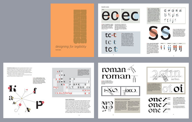
Reading Letters is a serious and engaging compilation of knowledge from the design and scientific communities, supplemented by visual examples of legibility. A must-have for type designers and graphic designers.
- A massive overview of knowledge from scientists and designers on legibility
- Beautifully illustrated with explanative examples
- A must-have for type designers and graphic designers.
Beier, S. (2012) Reading Letters: designing for legibility, BIS Publishers, 1-190