Typeface Personality
We can look at a typeface and see it, yet as soon as we start reading the text it presents we can no longer focus on the shapes and forms of that particular typeface.
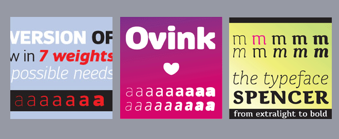
Typefaces vary widely in appearance. It is therefore puzzling that readers typically do not remember the image of the typeface they just read. We can look at a typeface and see it, yet as soon as we start reading the text it presents we can no longer focus on the shapes and forms of that particular typeface. Long ago, Beatrice Warde made the famous analogy to drinking wine from a clear thin crystal goblet, arguing that the content of a text is most enjoyable when read in what she called ‘invisible typography’. Yet, investigations into the semantic associations of typefaces demonstrate that typefaces are cable of conveying strong personalities that can carry an altogether different message from the content of the text and thus provide an additional layer in the communication with the audience.
Dissemination
- Beier, S. (2014) ‘The voice of a typeface’, ATypI, 17-21 September, Barcelona.
- Beier, S. & Larson, K. (2013) ‘How does typeface familiarity affect reading performance and reader preferences?’, Information Design Journal, 20(1), 16-31.